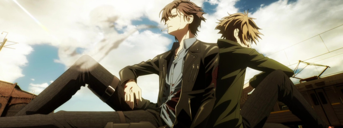

“Is he a complete idiot!? The guy was facing off against you. Arashiba Eiji. The most powerful Scard there is. Was he that clueless?”
To its credit, the first 10 seconds of Project Scard: Scar on the Praeter don’t look completely awful. There are even parts of this show that look… not terrible. If you don’t know why I’m talking as if I’m grading this on a massive scale, then today is the day I get to tell you about the horror story that is Go Hands. This is a studio whose work is so egregious that, if I don’t feel like vomiting while watching it, I come out of it feeling pretty good about things. Let me be clear though. This is still a good distance from being a good show. While the visuals didn’t make me feel sick, there was still a ton of camera movement which can make it difficult to pay attention to what is being said or is occurring. This isn’t a huge loss, as the dialog is nothing to write home about and contains a mountain of exposition. Everything about this show is clunky, and should only be checked out for the reason of morbid curiosity, but it massively exceeded my expectations by not literally making my eyes hurt.
Project Scard is a story about an autonomous urban region referred to as the Akatsuki Special Ward where various factions vie for dominance. If you’ve seen Black Lagoon, you probably have a sense of the setting already, though that comparison might not be all that fair due to Akatsuki lacking the sense of personality that Roanapur had. There are several factions introduced, but the only one that seems all that significant as far as this first episode is concerned is the group Helios led by Arashiba Eiji. Eiji dual wields pistols, possesses a magical tattoo called a Scard which he can use to deflect bullets and is referred to as the “Hero of Akatsuki.” Our lead, Kai Yamato, finds himself further drawn into the darker aspects of the city when he encounters his hero, Eiji, when attempting to help a kidnapped child. In theory, I could throw some discussions of additional narrative fluff in here, but the production is the most interesting aspect of this show by a country mile. The story is bland and forgettable, which isn’t isn’t a great combination for a studio which constantly seeks to wrest your attention away from what is being discussed via its overly busy visuals.
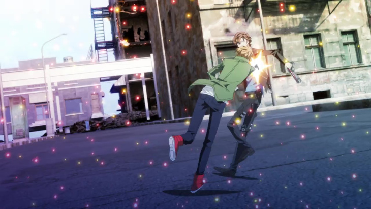
It’s been almost exactly two years since I watched Go Hands’ previous animated… project isn’t the word I wanted. What word am I trying to think of? Oh yeah, abomination. W’z was a nightmare to look at, blending real-world visuals with CG and traditional animation into a collage of terrible. Project Scard does two things to alleviate some of the worst mistakes of its predecessor: it limits itself to just using CG and traditional animation and it lessens its reliance on Go Hands’ obnoxious color filters. It’s worth noting that it doesn’t do away with the filters entirely, but less eye strain is never a bad thing. The CG isn’t great, but it’s used in a unified fashion which makes it easier to get used to. Everything but the characters and their clothes are animated using CG, and for the most part, the characters move through the environments well. The action scenes are where the backgrounds get abrasive as the movement gets ramped up, and inconsistencies in character placement become more apparent. The show also starts losing that sense that its characters are physically connected to the world they occupy as the backgrounds shift awkwardly. It’s messy, but I was able to finish the episode without being in physical pain. As I said before, Go Hands gets graded on an unusual curve.
Before I wrap up, a few Notes and Nitpicks:
- Given this show’s busy visuals, I could be wrong, but I believe the only instance of characters being animated using CG comes during the very intro to the episode. You’ll know it if you see it, because it looks like complete ass.
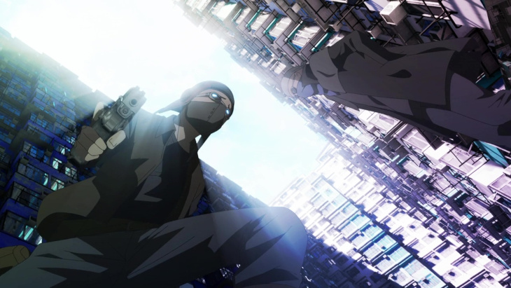
- The opening introductory segment had multiple instances of poor animation and integration that had me really worried. Dead bodies shift as the camera pans, and the water surrounding the city looks way too detailed considering the distance we’re observing it from (as can be seen in the screenshot up above).
- Sometimes I just dread going through an episode to find a good or representative quote to kick off the review. I also didn’t notice a good title card. I could take the time to really look, but I don’t want to test my luck by examining these visuals for too long.
- Go Hands… aren’t good at coming up with titles are they? It’s something that is easy to forget because of how abrasive their projects can be on every other level.

Add comment